

For easy data analysis presentation, you need to have a good pie chart. A good presentation should be easy to interpret and analyze; the pie chart can give your audience the right explanation for your information. Let’s learn how to create and edit a pie chart on Google Slides. Some people always transform the pie chart into a radial chart, but you need to understand how to create the pie chart. You can draw your pie chart from the shapes section, but we have a much easier and faster way.
1. Open Google Slides on your browsers (opera, chrome, Mozilla, etc.), open a blank document to create a new document, and add the title.
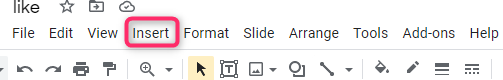
2. Go to the toolbar and click insert, as shown in the screenshot below.
3. Under insert, a menu will pop up, and you have to go to the section name pie and double click.

At that moment, you will have inserted the pie.
Now let’s edit the chart to fit our requirements and expectation. Don’t worry; that is not what will appear on your presentation; let’s edit the chart for your personal use.
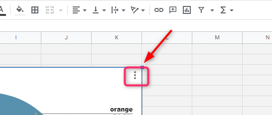
4. You will see the link icon at the top right corner. When you hover the mouse over the link, you will see the source link of the chart.

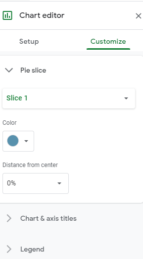
5. Click it, and you will be referred to the source. And here, at the source, you will edit every detail you want, from color to adding section titles and others. In the google sheet at the right top corner, you will see the burger button. Click it and click edit.
6. When it opens Google sheets, Go to the bottom left corner and select pie. Here will be able to add and change and remove some values for our pie.

7. The first column will be the name, and the second column will be the values. Let it do the calculation; you enter the values.

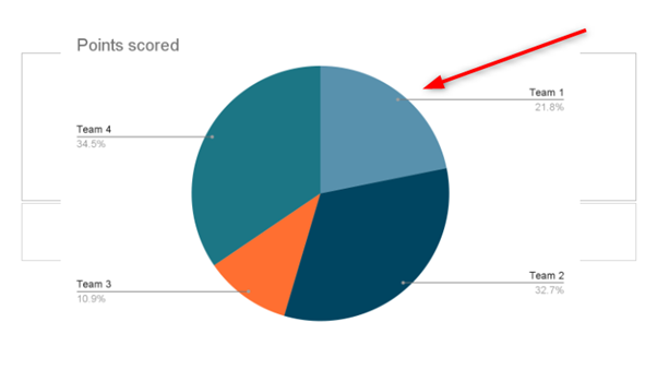
8. Click the chart to see what your pie looks like. How many section values and many others.

Here is mine.

9. As you can see have added other sections, and they are well analyzed. To change color and maybe
labels use the chart editor menu; it is pretty easy.
After editing the values, color, and labels, you can go back to Google Slide.
10. Hit update.


You can Add themes, songs, and all that. There is another way, but it involves drawing. Drawing is a little bit hard and takes time. If you love being the architect behind the story, you can use insert and click shapes. Then from there, insert every data one after the other. Google has made your work easy; you have only to insert values and change colors and backgrounds. They have also given you a chance to structure your label one can be like the key for the chart; you can name them.