

Using graphs is a simple way to visualize data. Most people or analyst prefers the use of graphs to understand variables relations. The best line of fit is also called A trend line. It is superimposed on the chart the trend of data. The lines can help you analyze data and understand the relationship between data elements.
It is hard to tell how data points are distributed. The trend can be upward or downward. At the same time, you need to make proper sense of the distribution. For example, we have a scatter chart, and we want to determine the trend line or the best line of fit.
How to make the best line of fit
Use the following data to come up with a scatter chart.
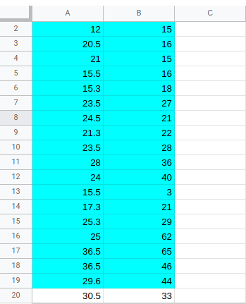
We have several cars advertised and several sales made.
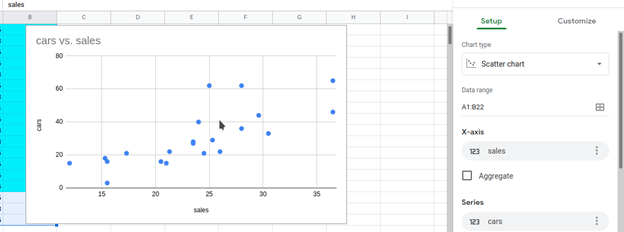
Create a scatter chart.
1. Select the data range. For us, the two columns A1:B22.
2. Navigate to the “toolbar” and click insert.

3. In the prompt menu, select the chart.

4. You will have the following result and a chart editor.
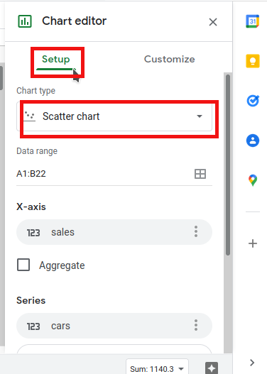
5. If the chart is scattered, go to the chart editor and select the setup tab. In the prompt menu, select chart type. Under chart type, select scatter chart.
TO create the best line of fit.
6. Go to the customize tab in the editors’ chart. Under customize, select series
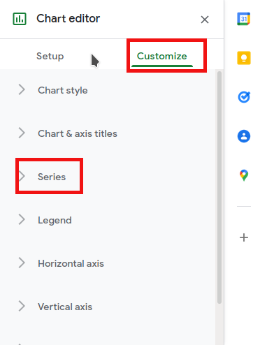
7. Scroll down under the series, and you will see three checkboxes. Under this section, select the trend line.

Here is how it will appear. The graph now can make sense, and one can determine if we have an upward or downward trend. The trend is increasing, and now it’s easy for any cashier, procurement manager, and other people to analyze the data easily.

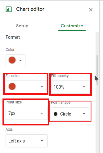
You can change the color of the line. Also, you can customize the color of the backgrounds and the scattered dots.
There are other options we can choose from or customize. The polynomial, the moving average, label custom, shows R2 and others. They are only here to help you get the actual visual of the chart. They can give you precise and accurate, but sometimes we work with average or close to the actual value.
You can change the opacity of the line, the thickness, and many more. The same goes for the dots and the graph itself. If you change the color of cars, you will alter the whole chart. You can play around with data until you get the insight into the data you want. The “best fit” line can help you observe trends and patterns in your data set. To Some personnel, the line of best fit can make them determine the relationship between variables. They can use the chart to identify the outlier within the dataset, which is sometimes difficult to identify. I hope the tutorial was helpful; share your skill in how to come up with trend lines on Google sheets.