

Graphs in Google Sheets and Excel are used to visualize the data. These two platforms are fitted with numerous types of charts. This allows users to choose the graph that fits their dataset best. Did you know you can join more than one graph in one chart? This post will guide you on combining two graphs in Google Sheets and Excel.
To combine two Graphs in Google Sheets
Table of Contents
Steps:
1. Visit the Google account and log in using your email detail (That is, https://www.google.com/account).
2. From Google Apps, click on the Sheets icon and select the existing Sheet.

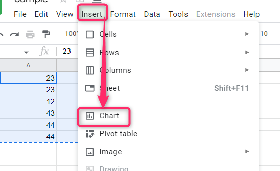
3. Locate the dataset you want to form two graphs. Click on the Insert tab on the toolbar.
4. From the menu, choose the Chart button.
5. Click on the drawn graph to open the Chart Editor on the right side of the screen.
6. On the Editor pane, click the Setup tab and locate the Chart type option.
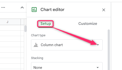
7. In the chart type drop-down menu, choose a Combo chart.

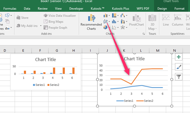
A combo chart combines a column graph and a line graph.

To combine two Graphs in Excel
a) Using the combo chart
Steps:
1. Open the Excel document that contains the dataset.
2. Highlight the dataset and click on the Insert tab on the toolbar.

3. In the Chart section, click on the column drop-down menu. Then, click on the More column charts option.

4. In the Change Chart Type box, click on the Combo button. Choose the combo graph in the list.

5. Finally, click on the Ok button.
b) Using the copy and paste tool
Steps:
1. Open the Excel document that contains the dataset.
2. Highlight the dataset and click on the Insert tab on the toolbar.

3. In the Chart section, click on the column drop-down menu. Choose a column graph.

4. Next, highlight the dataset and create a line graph. You now have two graphs: a line graph and a bar graph.
5. Right-click on one of the graphs and select the Copy option.

6. Then, right-click on the following graph that you want to combine with the combined one. Click on the Paste option.
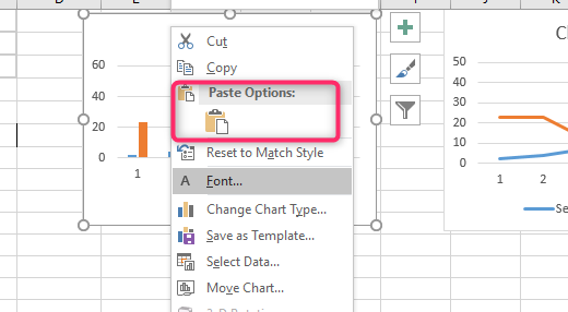
7. The two graphs will be combined.
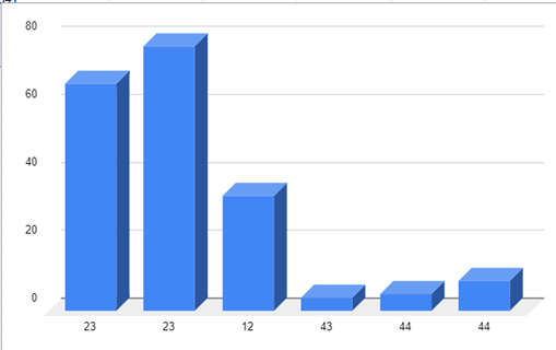
After combining the graphs, you can easily make them 3D.
How to create graphs in 3D
In Google Sheets
Steps:
1. Click on the drawn graph to open the Chart Editor on the right side of the screen.
2. Click on the Customize tab and the Chart style option on the Editor pane.

3. From this menu, locate the 3D section and check the 3D checkbox.

4. That’s all. The graph will be converted to 3D.
In Excel
Steps:
1. Open the Excel document that contains the dataset you want to convert to a 3D chart.
2. Highlight the dataset and click on the Insert tab on the toolbar.

3. In the Chart section, choose the chart you want.
4. Click on the columns or part of the chart drawn to open the Format Plot Area pane. Also, you can right-click on the graph and choose the Format plot area option.
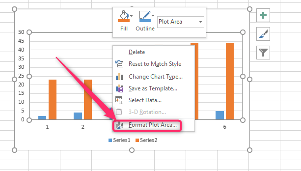
5. Click on the Effects button, and then click on the 3-D format button.

6. Make changes on 3D levels.