When analyzing information using Google docs, various tools may be involved. One of the greatest visualization tools in Google Docs is the Chart feature. This feature allows the Google Docs users to easily convert the entered information into a chart or a graph. Google Docs has numerous chart types that can be used. However, there are several ways and workarounds to initiate the chat feature. In this article, we shall discuss some of the ways that are used.
Using the Insert Feature
Table of Contents
On Google Docs, there are various tabs on the top part of the screen. The Insert Tab is one of these tabs. These tools can be used to add charts using the following steps;
1. On your pc, open the web browsers of your choice and open the Google Docs tab. That is, https://docs.google.com/document
2. Then, on the Google Docs welcome screen, select the Blank template. The one with the rainbow sign in the middle.
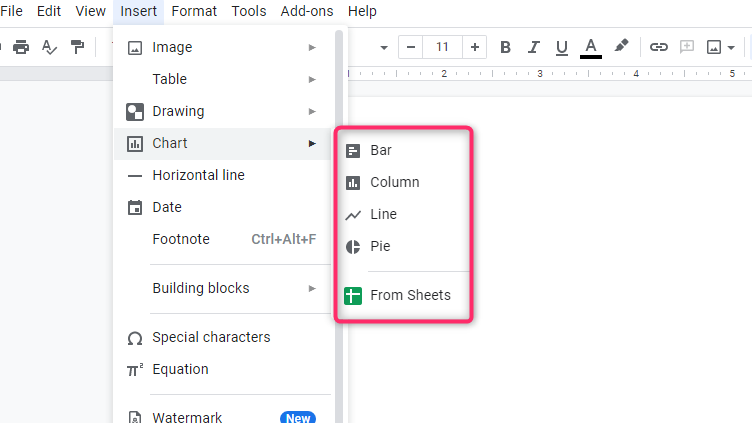
3. Once a new-blank document is opened, locate the insert tab found on the top bars. Click on it to open the drop-down menu.
4. On the Insert drop-down menu, hover your cursor on top of the “Chart Feature.” A side-view menu is opened and several types of charts are displayed.

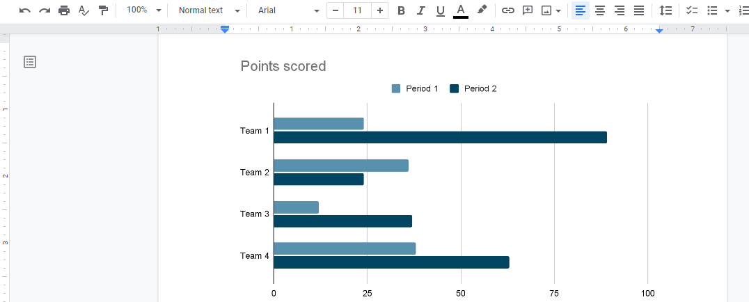
5. Select the type of chart that fits you best by clicking on it. By doing so, the chart template will have been added to your document. Now proceed and edit the template.

How to edit a chart
1. After clicking the chart that fits you best, the chart template is displayed on the blank screen and a pop-up message prompting you to edit the chart is also displayed. Click on the top right corner and select ‘open source’.

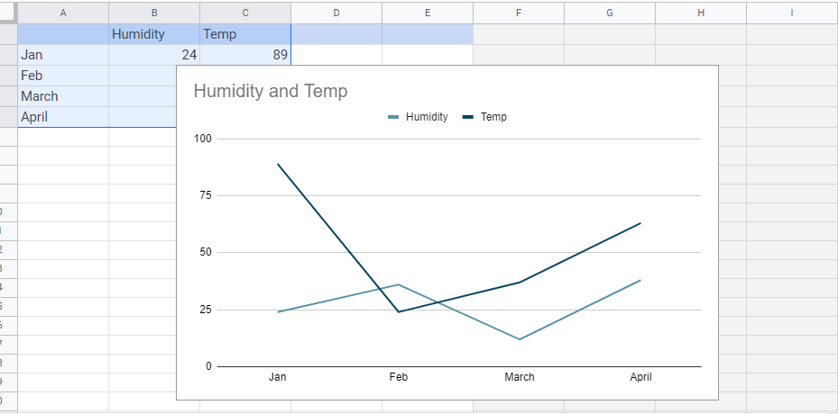
2. The google sheet will open and you can change and add the values of your chart from there.

Insert chart to Google Docs from an existing Google sheet.
Both Google Docs and Google Sheets are compatible, and therefore you can easily import a chart from Google Sheets to Google Docs. Here are the steps to do so;
1. Open Google Docs, That is, https://docs.google.com/document.
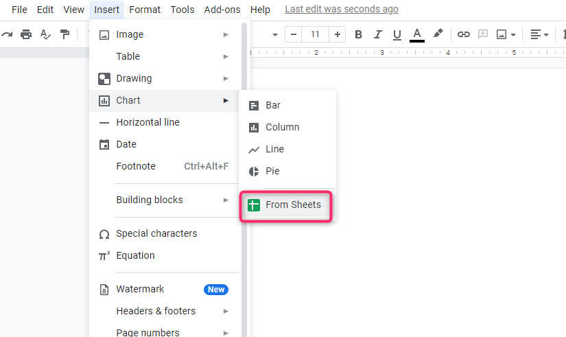
2. Then, on Google Docs locate and click on the Insert Tab. On the drop-down menu, hover the cursor on top of the charts tool to open the side-view menu. From this menu, choose the “From sheets”

4. A Dialogue box opens. Select the sheet that contains the chart you need to import.

5. You can either link or unlink the chart to the original spreadsheet. To unlink, simply uncheck the tick next to the “Link To spreadsheet” button.
6. Finally, click the import button and the chart will appear on the Google Docs screen.

Using copy and paste Tool
You can also copy and paste the tool to add the chart into your Google Docs. For example, you can use the Google sheet to obtain the data. Here are the steps to so;
1. When using Google Sheets, open the existing chart. Then, click on the chart.
2. Copy the chart. You can use the keyboard shortcuts, Ctrl +c
3. Then, open Google Docs and paste the chart there. You can use the keyboard shortcuts to do so ( Ctrl + v ).
How to create a chart Using Google Sheets
The following are the steps to follow when making a chart using Google Docs software.
Open Google Sheets
This is vital and the initial step when using Google docs to make charts.
- Open Google sheet software in any of your suitable web browsers.
The image below shows an empty spreadsheet that is ready to input data.
It contains tabs on the uppermost part of the screen, columns, and rows, which have numerous empty cells where you will input the data required in making the chart. The rows are named using numbers (1, 2, 3 …), while the columns are alphabetically named (a, b …
Create Chart data
After opening the Google sheet software, the next step is to;
- Create a spreadsheet to input the data you’d like to convert to a chart.
- Click “File,” on the left side of the tabs on the menu. Then click “new,” which appears after clicking the “File” tabs.
- After clicking the new tab, different types of sheets are displayed.
- Click on the “spreadsheet” and wait for the empty spreadsheet page to display how you will input the data.

Now the spreadsheet is ready to input data, and therefore, you can proceed to the next step.
Label the chart
- Input the values and other necessary information on the spreadsheet empty cells.
- Each row in the spreadsheet has different columns. The uppermost rows and the leftmost column in the spreadsheet contain the labels of the chart.
To illustrate this, let’s draw a chart showing the profit of a particular company recorded in three consecutive months, as shown below.

When entering data that should be converted to a chart, you should be careful to avoid errors associated with omission and swapping of values. The software will not detect the errors made preferably. It will output the data inputted hence resulting in an incorrect chart. Each data should match with its partner in the next column.
Highlight data
After entering all the information, the next step is simple t involves;
- Highlight all the inputted data. Be careful when highlighting, only the highlighted information will appear on the chart.
This is shown using the above example.

Insert Chart
This step involves converting the highlighted data to a suitable chart.
- Click insert
- The basic primary setting is “chart,” and it appears immediately the number of rows and columns.
- Lastly, click the “chart” part and wait for the data to convert to a chart automatically.

A chart will be populated automatically
- After clicking the “chart” setting, the data will automatically be converted to a chart, and it will automatically suggest the type of chart that fits your data best.
- The recommended chart is displayed on the same page as the inputted data. The location and the size of the chart can be changed and adjusted, respectively. Before changes are made on the chart, the uppermost rows, i.e., profit (sh.) vs. month, appear as the chart’s title and the labels of the chart’s axis.

However, you can choose the format of the Google chart that you want. The type of chart chosen will depend on the type of data one is working with. Changing the format of the chart is facilitated by the ‘chart editor,’ which is launched on the rightmost side of the sheet after converting data to a chart. The editor has numerous types of charts.
Change the chart type
This step mainly involves changing the type of chart that fits your data. This is largely done on the chart editor.
- Click the “chart type” setting and choose the type of chart that fits best the format of the data.
Below is an image of how to change the format of a chart.

This setting helps the user to change the format of the setting if they are not satisfied with the recommendation chart.
Customize the chart
This is the last and optional step that is aimed at customizing the Google chart to look exactly the way you want.
- Through this setting, you are able to access different styles and other settings that make the chart more presentable and easy to understand.
- The customizing setting is located in the chart editor, which is on the right side after the setup setting. This setting helps to update the title, axis, and presentation style by changing the color and styles of the chart.

Following the above steps makes it easier for new Google sheet users to create and edit their own charts without experiencing any challenges.

