

Bar graphs are used to compare two or additional values or variables. Bar graphs are straightforward to interpret and note the changes over time. They’re normally plotted against the x-y axis either vertically or horizontally. Follow these steps to make a bar graph:
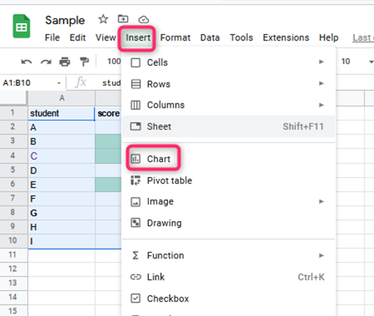
1. Visit the sheet and then open the Google sheet or a new sheet; if you want to make a new sheet, key in your data.
2. Choose the information you would like to incorporate within the Chart by clicking the primary cell and then holding the “shift” key on your computer or laptop keyboard while clicking the last cell

3. Within the prime toolbar, choose “Insert” then “Chart.”

4. within the pop-up chart menu, beneath “Chart Type,” choose the dropdown.
5. Scroll down to the “Bar section” and choose the Chart that best fits your data.

After coming up with the Chart, you may wish to customize it.
Customizing a chart
Table of Contents
1. On the pc, open a spreadsheet in Google Sheets.
2. Double-click the Chart you would like to make changes to.
3. Click ‘customize’ at the top
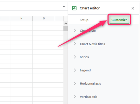
4. Make the following selections:
- Chart style
It changes the Chart’s appearance.

- Chart & axis titles
Helps to edit or format title text.

- Series
It Changes bar colors, and axis location or adds error bars, data labels, or lines of best fit/trendline
- Legend
It changes the legend position and text.

- Horizontal axis
It helps to edit or format axis text or reverse axis order.
- Vertical axis
It helps to edit or format axis text, set min or maximum value, or log scale
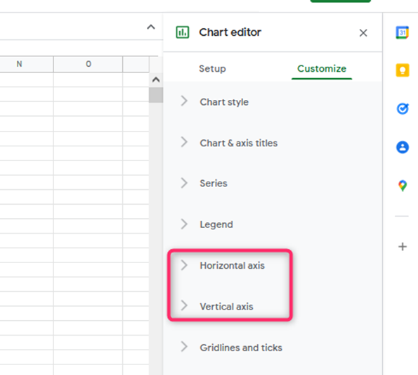
- Gridlines
It helps to feature and edit gridlines.
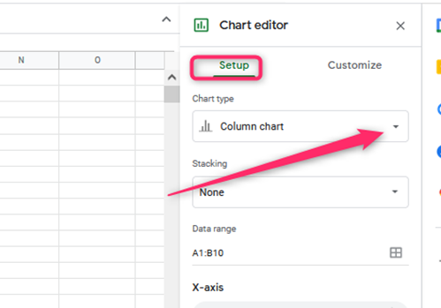
How to produce a Stacked chart in Google Sheets
Standard stacked bar graphs are helpful if you need to work with multiple data ranges.
1. Go to Chart Editor and click on the chart editor choice
2. Under the Stacking choice, make a selection of standards. You’ll be able to opt for the 100 percent choice to get a quantitative relation /ratio of the data to the full set.
Creating a chart with Multiple Variables in Google Sheets
The following are the steps to make a chart in Google sheets when operating with multiple variables.
1. Build a range for your data
First, if you would like to make a selection of your data range—Press ctrl+c to change this.
2. Insert a graph
Click the Insert tab then ‘chart.’ By clicking on the ‘chart’ choice, a chart will show within the spreadsheet.
How to come up with a double bar line Graph In Google Sheets
A bar line graph will be effective if you’ve got two data sets to plot on one graph. Here are the steps to make a bar line graph in Google sheets.
1. Enter data
The first step is to key in the values for the datasheet.
2. Make a double line bar graph
Next, highlight the values and click on the Insert tab. There, click Chart. Once you complete this step, the bar line graph will show on the spreadsheet.

How to come up with a chart in Google Sheets with One Column of Data
Typically you’ll be able to work with only one column of data and not the usual huge amounts of data. The following steps help to come up with a chart :
1. Choose the data by pressing ctrl+c and choose the data you would like to show in the Chart.
2. Make a chart
Click on the Insert tab, then ‘chart.’ Once you click it, a chart will show

3. Choose a stacked chart

4. Beneath the customize button, click the stacking choice. Make a selection that best suits your data under the stacking option.