

Line graphs are easy to make in Google Sheets. Line graphs are the most effective charts to show changes over time, whether over long or short periods. They are easy to analyze and evaluate data and draw comparisons when used as a double-line graph.
How to come up with a simple line chart
Table of Contents
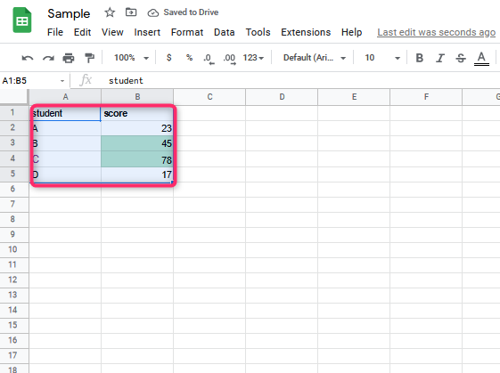
1. Select the data set. You can also make a selection of any cell within the dataset
2. Click on the ‘Insert chart’ icon from the toolbar. Alternatively, go to the Insert option in the menu and click on “Chart.”

The following are the steps to change any other chart type into a line chart:
1. Select the Chart you want to change into a line chart
2. Point to the three dots that show at the top-right part of the Chart
3. Click on the ‘Edit chart’ option. A chart editor pane should open.

4. Click on Setup within the chart editor pane

5. Make a Selection of the Line chart option in the chart type drop-down

The Chart will be changed into a line chart
Creating a line graph In Google Sheets with multiple lines
1. Choose the dataset. You can also make a selection of any cell within the dataset
2. Click on the ‘Insert chart’ icon from the toolbar or click on Chart under the insert option from the menu

How to customize a line chart
1. On the computer, open a spreadsheet in Google Sheets.
2. On the Chart you want to change, double click on it
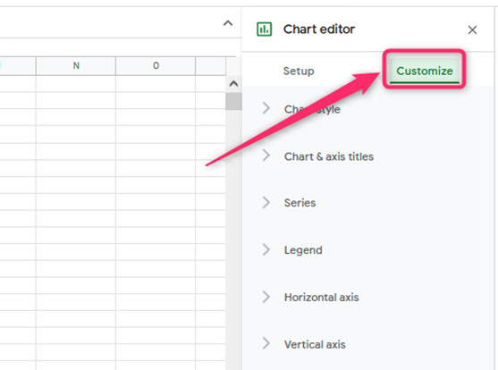
3. At the right, click Customize.
4. Choose the following options:
- Chart style
It will change how the Chart looks.

- Chart & axis titles
It will edit or format the title text.

- Series
It will change line colors and axis location or add error bars, data labels, or trend lines.
- Legend
It will change the legend position and text.

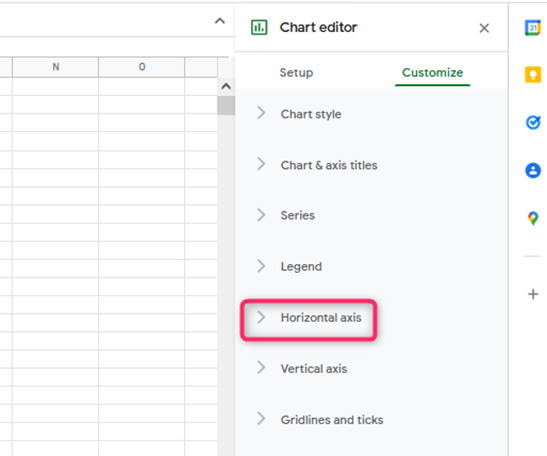
- Horizontal axis
It will edit or format axis text or reverse axis order.
- Vertical axis
It will edit or format axis text, set min or max value, or log scale.

- Gridlines
It will add and edit the grid
Making a line graph on Google Sheets combined with a column graph/combo chart
1. Select the dataset

2. Click on the ‘Insert chart’ icon from the toolbar. Alternatively, go to the Insert option in the menu and click on Chart.
3. In the chart editor, click on the ‘Chart type’ drop-down within the Setup tab and then click on the Combo chart option.

4. Add a secondary axis and plot profit figures on the secondary axis by:
- Click on the Chart.
- Point to the three dots that appear at the top-right part of the Chart.
- Click on the Edit chart option
- Click on the Customize option from the chart editor

- Click on the series option

- Choose the series you want to put on the secondary axis from the drop-down list.
- In the ‘Axis’ option drop-down, choose the ‘Right axis’ option
It will add a secondary axis to the combo chart making it complete