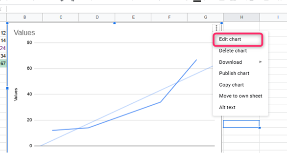
A ‘line of best fit’ or Trendline is superimposed on a chart to know trends inside the information. These lines will assist you in perceiving the direction of the information, building forecasts, and perceiving relationships between information components. Bear in mind that before you produce a trendline, you’ll make a bar chart, line chart, column chart, or scatter chart first. The following are steps on how to come up with a line of best fit:
1. On the pc, open a spreadsheet in Google Sheets.
2. Double-click a chart.

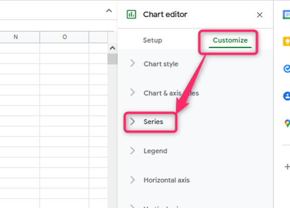
3. Click customize then series; at the right

4. Next to “Apply to,” select the data series you would like to feature the Trendline. This step isn’t a requirement.
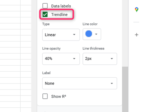
5. Click Trendline. If you don’t see this feature, trendlines don’t work together with your information.

Alternatively, you can come up with a line of best fit by :
1. Open the Chart Editor and choose Edit Chart.

2. Switch to the customize tab of the Chart Editor by clicking the word customize at the top of the editor.

3. Click on the series menu to expand
4. Scroll down within the Series menu section until you discover the checkbox tagged Trendline and check

5. A trendline will then show on the scatter plot
After making a trendline or line of best fit, you might have to make changes to it to best suit your necessities.
Making changes to a trendline
1. On the pc, open a spreadsheet in Google Sheets.
2. Double-click a chart.
3. Click customize then Series at the right

4. Optional: Next to “Apply to,” select the information series you would like to feature the Trendline.
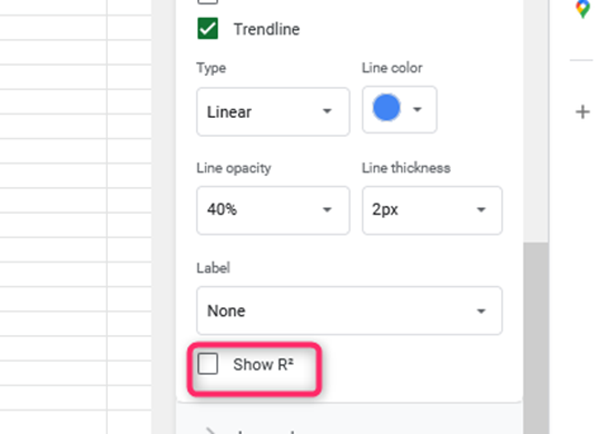
5. Below “Trendline,” you’ll edit:
- Trendline type
- Line color, opacity, or thickness.
- Labels.

* R square. It displays how closely the Trendline relates to or fits the data. The nearer to R^2 = 1, the closer the fit. It is limited to adding a legend.

- Polynomial degrees.
It is limited to polynomial trendlines.
- Average types.
It is limited to moving average trendlines.
- Periods.
It is limited to moving average trendlines.
There are different types of trendlines, and their various equations are as follows:
- Linear
It is used for the data that closely follows a straight line. The Trendline equation for linear is y = mx+b.
- Exponential
It is used for data that rises and falls proportional to its current value.
The trendline equation for exponential is y = A*e^(Bx).
- Polynomial
It is used for data that varies
The trendline equation for polynomial is ax^n + bx^(n-1) + … + zx^0.
- Logarithmic.
It is used for data that rises or falls at a fast rate and then flattens out. The trendline equation for logarithmic is y = A*ln(x) + B.
- Power series
It is used for data that goes up or falls proportional to its current value at the same rate.
The trendline equation for the power series is y = A*x^b.
Moving average: Helps to make data smooth that is unstable or more variable.

