Google Sheets and Excel contain features such as graphs and charts that help us to analyze and present data in an organized manner. Any form of the chart can have a chart title and axis titles to make it simpler to interpret. All of the axes that can be displayed in a chart can normally have axes titles. Axes are present in several chart formats, but axis titles cannot be displayed automatically unless you follow some steps to do so. Pie charts and other charts without axes cannot have axis titles added.
Google sheets;
Table of Contents
1. Open your chart or graph on Google Sheets in your web browser.
2. Click the options button (three-dot icon) at the top right corner of the graph. From the options generated select Edit chart.

3. From the Chart editor menu, Switch from setup to Customize by Clicking the Customize option.

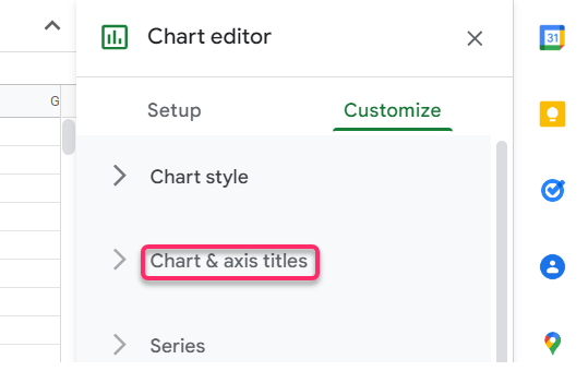
4. Now click the Chart & axis titles to customize the axis.
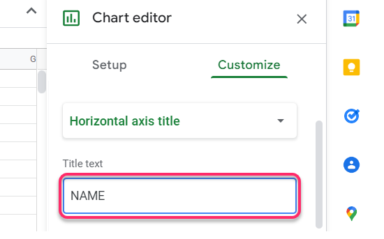
5. To label the horizontal axis, click the dropdown and select the Horizontal axis title.

6. Then enter the name of the Horizontal axis in the Text field provided and click enter. You will notice that the name of the horizontal axis appears.
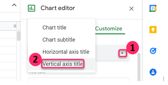
7. To label the vertical Axis, let us repeat the same steps.
Click the dropdown again and select the Vertical axis title.
Then enter the name of the Vertical axis in the Text field provided and click enter. Now the name of the axis appears on the vertical side of the graph.
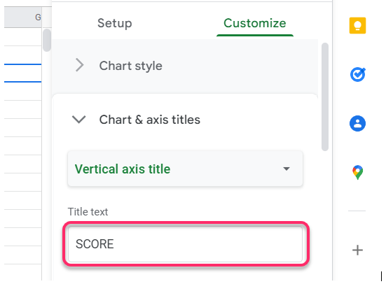
And that’s how we label the axis in Google sheets.
In Excel;
1. Open Excel from your computer applications and generate your chart. Now let us label the axis titles. Click the bold Plus Sign (+) at the top right of the chart.
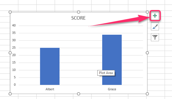
2. From the chart Elements options provided click Axis Titles.

3. Look at the chart that you generated and you will notice that On both the horizontal and vertical sides of the charts there are labels written Axis Title. Now edit those labels and put your preferred Axis titles for both Horizontal and vertical.

And that’s it. That is how we label axis titles in excel.

