

Using graphs to represent numerical information in your Google Slides is essential. This makes it easy for your readers to understand the data being represented. This article shows you easy steps to use when creating graphs and other charts on a Google Slide. The information you are trying to convey will thus be made more apparent to your audience at a glance.
Charts and graphs usually get linked to Google Sheets documents whenever they are created on Google Slides. Follow the easy steps below;
1. Choose on the slide that you want to create a graph/chart in

2. Open Insert, then click on chart

3. Different options appear once you do this, ranging from the bar, pie, column, and line charts. You can also add a chart to a Google Sheet document. Select the kind of chart of your choice.
4. The graph you selected inserts itself into the document as an image.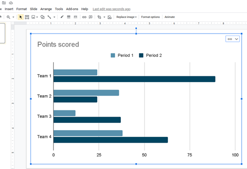
5. Select Edit in sheets to edit the chart you have selected.
6.
Select Link options to open a Google Sheet document
7. Open Google Slides after you have modified the information on the chart
Alternatively, copy and paste the chart to Google Slide from Google Sheets. Press Ctrl + C.
How to edit the graph/ chart
Use the following steps;
1. Select the graph that you want to edit
2. Click the link option > Click open

3. To edit colors, Choose the color you prefer >
Click on Edit chart
4. Open Setup Tab and make the necessary changes
5. Open “Customize“
and make the necessary editing for your chart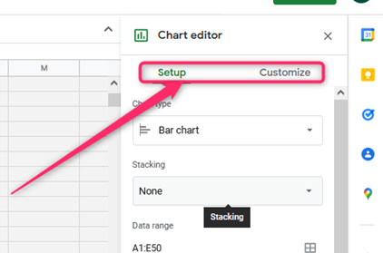
Alternatively, first set up a slideshow by creating a new file or using the existing one. If you had earlier created a graph, click on Insert then Image. Your chart will automatically be moved to the presentation. To make a new chart, use the following steps;
1. Open Insert
2. Select Chart
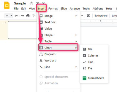
3. Select the style/ design you want, depending on your data type. 
4. The graph will then be added to the slideshow on the Google Slide
5. Open the dropdown menu that is at the right corner on the graph
6. Click “Open Source”; thus, you can start to edit your graph
The Chart Editor
1. Open the chart Editor by clicking Open Source
2. The chart editor usually opens near your spreadsheet, which is red. It has two sections that have the options of “Customize”‘ and “Setup.” 
3. Click on Setup to control design and data options in your graph. This section has options like “Chart type,” “Stacking,” and “Data range.”

4. Click on Customize to edit using options like “Chart Style and Axis Title,” an option that allows you to change the title of the chart and the Title Font as well, “Series,” “Horizontal axis,” and “Vertical axis.”

5. The “Chart Style” helps you edit the background’s color in your chart, the color of the borders, and the font of the chart contents.