

Adding a secondary y-axis to your Google Sheets document makes your data easily readable. Adding this axis is quite easy through the use of the chart editor. Adding another axis to your chart makes your data easy to interpret when you already have one variable in your chart. This article shows you how to add the y-axis to Google sheets.
Adding a secondary Y-Axis
Table of Contents
To do this,
1. Create a chart by highlighting your data

2. Select Insert
3. Click on Chart

4. Click on the three-dot menu at the top corner of your monitor

5. Select on Edit chart

6. Click on Customize Tab
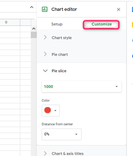
Go to the series tab and then select it. It expands the option. Choose the Series that you want to add Y-axis.
1. Choose the Right axis under the Axis option

An additional axis will hence be added on the right side of your chart. You can also follow the easy step below to add a second y-axis in Google Sheets.
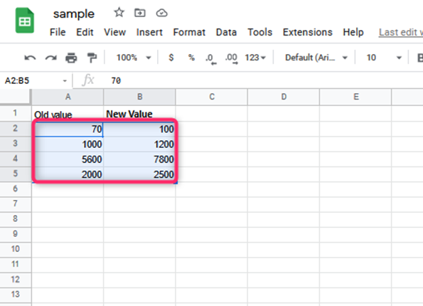
2. Create the Data on your Google Sheet
3. Create the Chart by
- Highlighting the cells
- Clicking the Insert tab
- Clicking the Chart

Adding the Second Y-axis. In this case, you will use the following simple steps;
1. Select the Chart editor that is on the right side of the monitor
2. Go to Customize tab and click on it

3. Select Series from the choices that appear

4. Select Return
5. Under the axis, select the Right axis. The axis you selected will automatically appear on the right- side of the chart.
At times, when you already have your x and y- axes. The software will automatically pick each column for your x and y- axes. However, it may not match what you want. You can thus switch the x and y-axis in the Google Sheets using the Chart Editor sidebar.
How to Switch x and y- axes in Google Sheets
You can use the following simple steps;
1. Click anywhere on your graph or chart
2. An ellipsis appears on the right corner of the box containing the graph

3. Select this ellipsis, then click on Edit Chart

4. You can also right-click the chart and then select the Data range
5. The Chart Editor appears on your Google Sheets window. You are thus able to set your chart by styling it.
6. Click on Setup on the Chart Editor

7. Click on the current x-axis column to change it to a y-axis

8. The list of available columns will be displayed in a dropdown menu. Choose the column that you now want to use as your x-axis.
9. To change the y- axis column, go to Series in the Chart Editor

10. Select the column that you want to use as the y- axis now
After this, the data you have will appear, but the axes will be switched just as you wanted them. Double-click the label text and then type the new axis label to change the axis labels.