

A Scatter plot is a type of chart in Google sheet that is used to plot the points of the dataset. This tool helps users to draw the points along the x and y-axis. It helps monitor how the data is distributed across the chart, and you can easily determine the relationship between one data and another. Google Sheets has simplified the process of constructing scatter plots. This article will discuss some of the steps followed when constructing a scatter plot.
Using the Menu bar to construct the scatter plot chart
Table of Contents
To make a scatter plot using the menu bar, follow these steps:
1. Open existing or new Google sheet documents.
2. In the case of a new sheet, enter the dataset you wish to convert to a chart in the empty cells. Then, highlight the dataset.

3. On the “menu bar, “locate and click on the Insert tab. Then, click the chart option.

4. A suggestion chart will be drawn. Convert the drawn chart into a scatter plot. That is;
- Locate the dialogue box on the right side of the screen. Click the setup tab within the chart editor dialogue box.

-
Then, select the Scatter plot chart icon from the chart type drop-down menu.

5. Your chart will be converted into a scatter plot chart.
Using the Toolbar to construct the scatter plot chart
Follow these steps;
1. Open the Existing Google sheet or new sheet.
2. Enter your dataset in the empty cells. After entering the data, select the cells that contain the dataset.

3. From the list of toolbar buttons. Select the chart button. 
4. The dataset will automatically convert to a suggested chart.
5. Using the Chart editor dialogue box, change the chart type. Tap the “chart type” drop-down menu and select the Scatter plot chart.

Adding trend line on the Scatter plot
Once you have created the scatter plot, you can add the trend line. Follow these steps to do so:
1. Click on the plotted graph to enable editing.
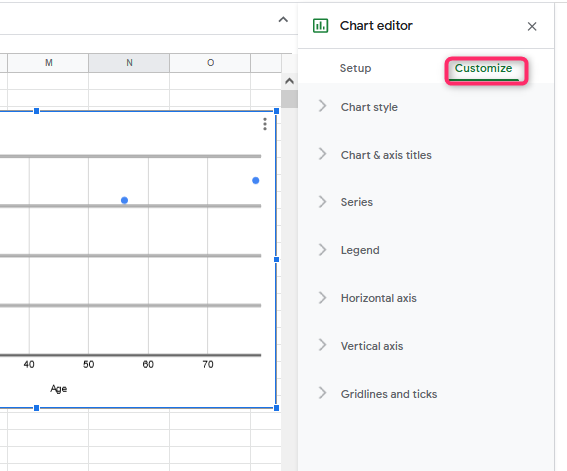
2. The Chart editor dialogue box opens. Tap on the “customize tab” on the chart editor dialogue box.
3. Click the Series button, and scroll down to check the trend line checkbox.

Customizing the scatter chart
Follow these steps:
1. On the chart drawn, double click to open a chart editor dialogue box. From the box, click the customize tab.

2. To change the style of the chart, click the chart style button. It allows you to change the background color, the font, and the chart border color.
3. Next, you can customize the chart axis and titles. To do so, click the chart & axis titles.
4. To alter the chart Series, click the series button, and play around with the various features.
5. To customize the horizontal and vertical axis, click the Horizontal or vertical axis button.