

Google Sheets allows users to make a variety of graphs and charts that represent the data in the document. The x-y Graph is one of the most useful features that you can make to enhance data representation on Google Sheets. In some cases, it is also known as the scatter Graph. This Graph plots data points to show the relationship between two sets of information. There are a variety of techniques that Google Sheets offers that can be used to create an XY graph in a document. Use the following steps;
Create the data for the graph
Table of Contents
Open Google Sheets so that you can enter the data. Follow the steps given below;
1. Open a spreadsheet on Google Sheets
2. Click on a cell to select it
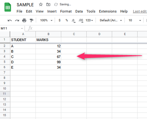
3. Type in your data in the cell
Select the data that you want to put in the Graph
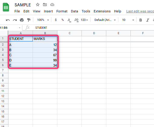
1. These two columns in your document contain the data you want to compare in your Graph. Click and select the column names of the data. You can also use the Keyboard shortcut Shift+ multiple columns. On Mac, press the Command Key as you click. While highlighting the cells, ensure that you include the headers and labels.
Make the chart
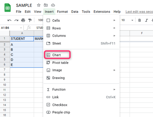
2. Open on Insert to open the menu. Choose the option Chart. It makes a box appear that contains the Graph with the data you initially selected. In short;
- Click on Insert
- Click on type
- Scroll down and click on the data you want
- Check the box on the upper left
3. Change the chart type
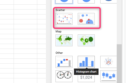
Open on Chart Editor and click on Chart type.
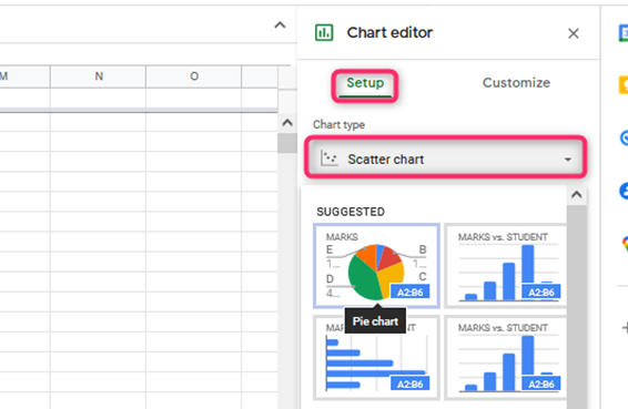
The Scatter chart option is among the choices which you will then choose. It converts the data into an x- y graph.
4. Data Visuals Enhancement
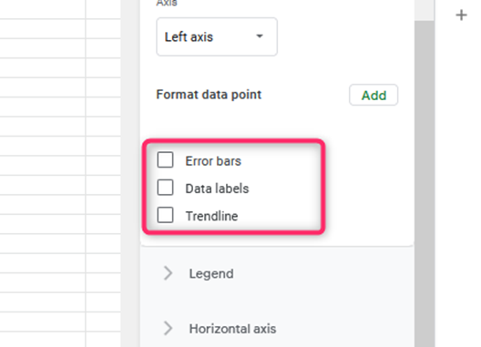
Open the Chart Editor option and click on Customize. Scroll down until you get to the Trend line, Data Labels, and Error bars options. You can then add these to your Graph to enhance your data visuals.
5. Customize the x- y graph
Open the chart editor, then click on Customize menu. You can then use this to modify the text size, names of the axes, and color of the font of your graph data. You can add a Second Axis by choosing the series option by opening the customize tab. Select the side that you want to place on the second axis.

When to use the x-y graph?
The following are scenarios in which you can use the x- y graph.
1. When you want to investigate the relationship between variables
You can determine the relationship between key variables in your data.
2. When you want to visualize causal-effect relationships when comparing business information
You can thus determine the money-draining factors in your business and work on them.
3. When you have variables that pair well with each other
Therefore, the x- y graph comes in handy when you want to compare the relationship between variables in your data. Furthermore, it is easy to read and interpret for all its users.