

Google sheet is a powerful tool for visualizing data. Google sheets charts represent data in terms of x and y axes. The x-axis is the baseline that runs from left to right, and thus it is horizontal. On the other side, the y-axis is a vertical line that runs from top to bottom. The Google sheets create one axis for x and one axis for y data by default. However, you can add another Y-axis to make them two.
Let us discuss the steps to make a two y-axes graph.
Table of Contents
1. Open the Existing Google sheet or new sheet that you want to make two y-axes. Make sure you have an email account to open the Google sheet. Then, open the Google sheet using the browser of your choice (chrome, firefox, etc.). To open the Google sheet, search for a google account. That is, https://www.google.com/account
2. Enter your dataset on the empty cells. Make sure your dataset has two columns:
the Age and salary column.
3. Next, highlight the two columns that contain your dataset. Here you can either use the menu bar or toolbar to enable the chart.
If you’re using the menu bar, follow these steps:
- Click on the Insert tab.
- Then, select the chart button from the drop-down.

- A suggestion chart will be displayed.
If you prefer using the toolbar, follow these steps:
- From the list of toolbar buttons. Select the chart button.

- The dataset will automatically convert to a suggested chart.
4. Click on the drawn chart to enable the chart editor dialogue box.
5. Select the chart type drop-down button from the box and select the column chart. 
6. Then, click the setup tab, navigate to Series and add another series.
7. Then, click the customize tab on the chart editor dialogue box. Click the Series option.
8. From the Axis section, change to the right.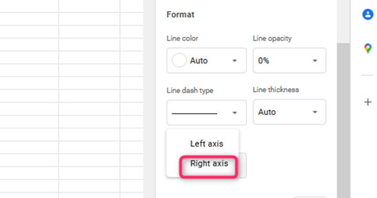
That’s all.

Customizing the two Y axes chart
Steps to be followed:
1. On the chart drawn, double click.
2. A chart editor dialogue box is opened. From the box, click the customize tab.
3. To change the style of the chart, click the chart style button. It allows you to change the background color, the font, and the chart border color.
4. Next, you can customize the chart axis and titles. To do so, click the chart & axis titles.
5. To alter the Series of the chart, click the series button, and play around with the various features.
6. The axis is the main component making up the chart; to customize its properties, click the Horizontal or vertical axis button.