
A histogram is a chart that shows how a variable is distributed. It is used to understand the distribution of data. A histogram divides your data range into intervals and displays how many data values fall into each interval. Each bar height represents the frequency of data points in that range. Google Sheets simplifies the generation of histograms from spreadsheet data. The histogram will automatically update and reflect the change when your data updates. To make the histogram for the data below, follow these steps:
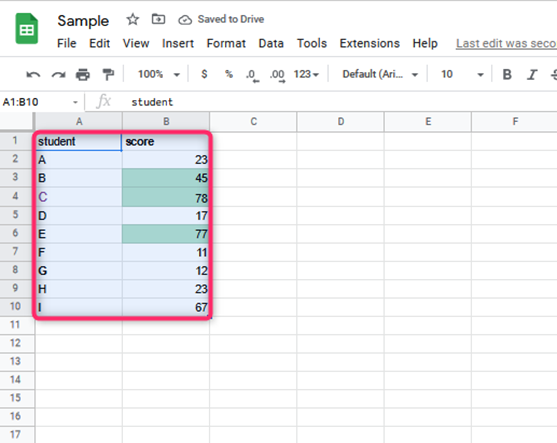
Highlight the data you need to visualize in the histogram. Furthermore, you can include the cell containing the column title.
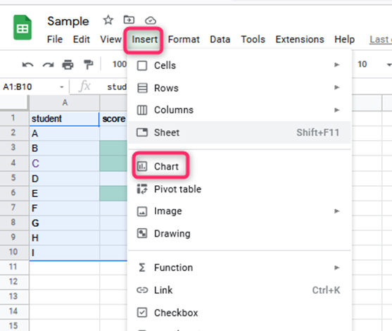
1. Click the Insert menu from the menu bar.
2. Click on the “chart” option. A chart will display on the worksheet and a Chart editor sidebar on the right side of the window chart.
3. Select the Setup tab from the Chart editor sidebar and click on the dropdown menu under “Chart type.”
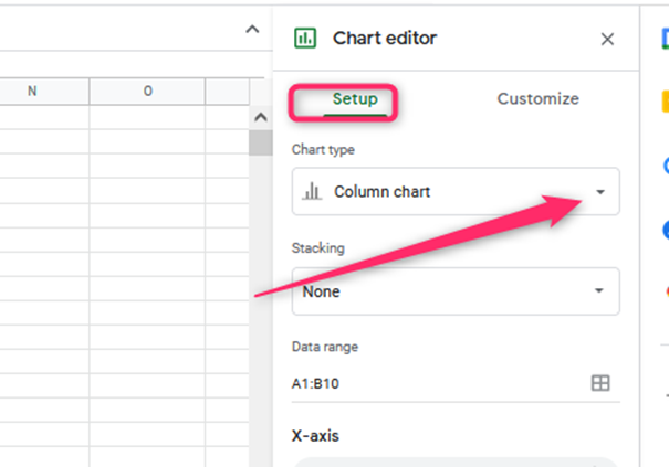
4. Choose “Histogram chart” from the chart options you will see. It should be seen under the “Other” category.

5. The chart will then be a histogram
After creating a histogram on Google sheets, you may need to edit or format it to fit best the calculation you need.
To customize a histogram chart, follow these steps:
1. On the computer, open a spreadsheet in Google Sheets.
2. Double-click the chart you want to format
3. At the right, click Customize.
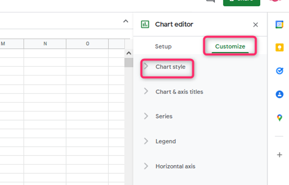
4. Choose an option:
- The Chart style
It will Change how the chart looks.
- Histogram
It shows the item dividers or will change bucket size or outlier percentile.
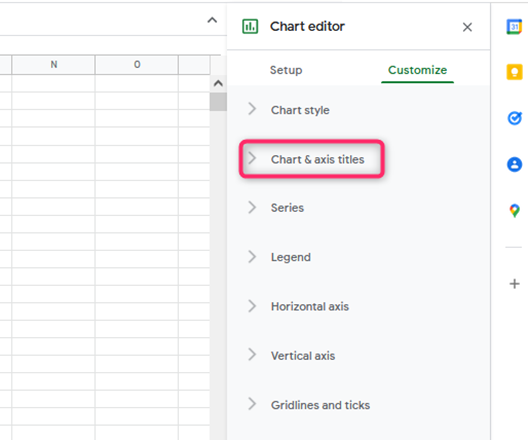
- Chart & axis titles
It will edit or format the title text.
- Series
It will change bar colors.
- Legend
It will change the legend position and text.

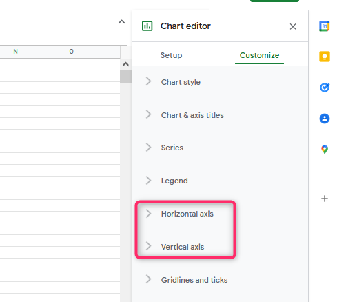
- Horizontal axis
It will edit or format axis text or set min or max values.
- Vertical axis
It will edit or format axis text, set min or max value, or log scale.
- Gridlines
It will add and edit gridlines
Alternative method
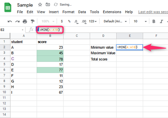
1. Finding means standard deviation, maximum and minimum value, and count. Start with Mathematics data, then create a new Sheet by clicking on the + symbol at the bottom. Copy the entire Mathematics data in the newly created sheet
Mean: =AVERAGE(A:A1001)
Standard deviation: =STDEVP(A:A1001)
Minimum value: =MIN(A:A10)
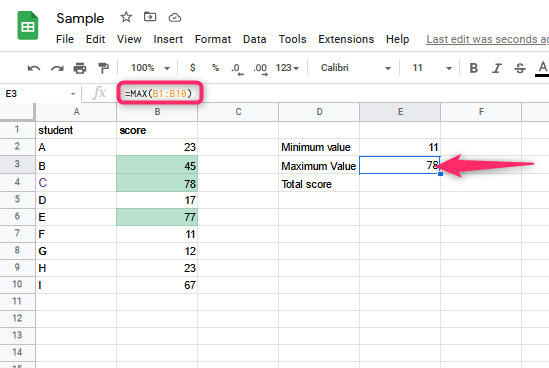
Maximum value: =MAX(B1:B10)
Total scores: =COUNT(B1:B10)

2. Select the entire column A of Maths score.
3. Click on Insert -> Click on Chart. Select “histogram chart “from the chart type option

4. Set the bin size by :
- Clicking on customize, then histogram.
- Select bucket size. Enter the bucket size of choice
To fix an extra bin, follow these steps:
After going through the work and you note there’s an extra bin, let’s say after 100, you can remove it by:
1. To Chart Editor -> Customize tab.

2. Click on the Horizontal Axis.
3. In the Max option, enter 100.
4. Edit the chart’s title, horizontal and vertical axis, and even change its font color and size.